Evan Zamir at The City recently unveiled Adjusted 4-Factors at the individual level, using a 2.5 year sample size and a Ridge Regression approach. The results are very interesting.
Here, I’m simply converting his initial work into an interactive visualization.
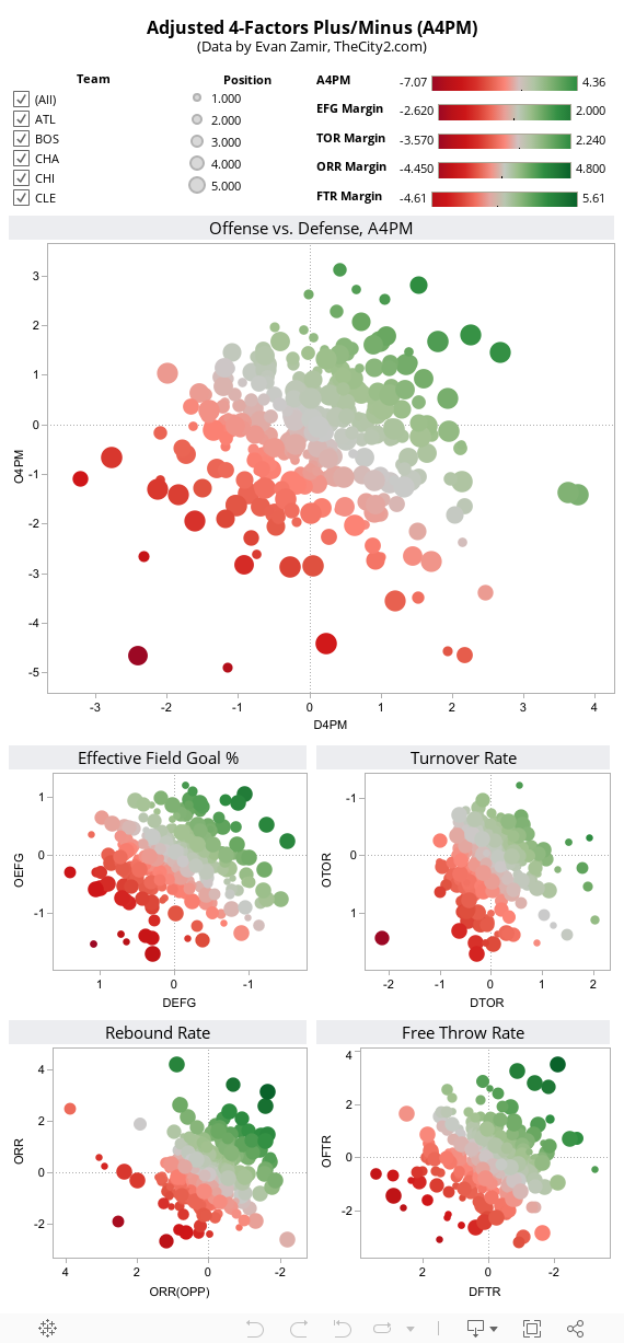
New Player Metric: 2.5-Year Adjusted Four Factor +/- (A4PM) | The City
[…] Daniel (@DSMok1) made a cool Tableau visualization for A4PM: Interactive Visualization of @thecity2 ‘s Adjusted 4 Factors data: godismyjudgeok.com/DStats/2012/nb… […]
2014 midseason WNBA statistics: The Phoenix Mercury's dominance, the Minnesota Lynx's potential - statsmagazine.com
[…] has been some pretty cool work on how individual NBA players impact a team’s offensive rebounding percentage, including […]