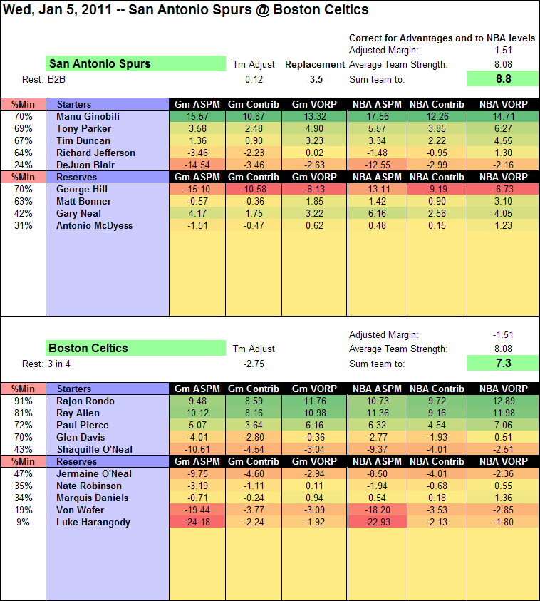
Recently, I developed a method for analyzing single games through the Advanced Statistical Plus/Minus (ASPM) lens. Basically, in order to keep the data in the range where the weights for the stats makes sense (some of the weights are nonlinear), I add several games worth of average stats to the player’s stat line. I then analyze this composite stat line, and generate an ASPM value for it. Then I back-calculate the value for the game, basically “undoing” a weighted average. I use 3 games worth of average values to allow variation into the nonlinear parts of the regression, while still staying in the parts where the original regression makes sense.
Over at APBRmetrics, I’ve worked with Advanced Statistical Plus/Minus (ASPM) extensively. Glance at the following threads to get up to speed:
Yesterday’s game was particularly interesting–the Spurs and Celtics are the 2nd and 3rd best teams in the league thus far. How did the players do?
Well, look at the box score on Basketball Reference. The big 3 from the Spurs played well, and Rondo and Ray Allen were amazing.
Here’s the ASPM version of the box score:
Ginobilli was really the star of the game. Why? What did he do more than Rondo or Allen? Let’s have a look at their stats:
| Starters | MP | TS% | eFG% | ORB% | DRB% | TRB% | AST% | STL% | BLK% | TOV% | USG% | ORtg | DRtg |
|---|---|---|---|---|---|---|---|---|---|---|---|---|---|
| Manu Ginobili | 33.52 | 77.3% | 70.8% | 10.6 | 18.7 | 15.7 | 11.9 | 7.9 | 0 | 20.5 | 28.9 | 131 | 102 |
| Rajon Rondo | 43.50 | 60.0% | 60.0% | 12.3 | 16.8 | 15.1 | 61.6 | 7.3 | 1.7 | 33.3 | 17.1 | 129 | 100 |
| Ray Allen | 38.70 | 85.2% | 87.5% | 0 | 5.4 | 3.4 | 24.9 | 1.4 | 0 | 5.2 | 24.7 | 159 | 119 |
Okay, so maybe his stats weren’t really that much better than the other 2. He had the highest usage, and that is worth a bunch when accounting for TS%. He also led in steal% (with a ridiculous 5 steals in 33 minutes). Taken all together, he did have the best stats of the bunch. Much of the difference, though, was actually in the team adjustment, seen in the image above–without this, their totals are all fairly close. Boston had a ton of steals and blocks and the system handed out a bunch of defensive credit–but their defense wasn’t actually good (113.4 rating allowed). So there is a big team adjustment because of the poor defensive showing, dropping all players on the team down so the totals sum as they should. This is one of the quirks to the system.
Glossary:
- Gm: stat compared to other players in this game–home court, rest, and quality of teams ignored
- NBA: stat compared to NBA average (rest, home court, and quality of teams accounted for)
- %Min: Percent of minutes played
- ASPM: Advanced Statistical Plus/Minus (see threads on APBRmetrics), measuring each player’s value in points per 100 possessions (where 0 is average).
- Contrib: Each player’s contribution to the team, in points per 100 TEAM possessions (if you don’t play, you don’t contribute) (0 is average)
- VORP: Value over replacement player: a replacement player is estimated at -3.5 points per 100 possessions played. If the player is better than that, he has value to the team. Measured in points per 100 TEAM possessions.

I’ve always had a thing for heatmaps. So easy to read, but the data’s still there. Great website!
I love the gradient-based conditional formatting in Excel! Too bad there isn’t any table widget on the web that does it server-side for html tables. At least, none that I’ve found.
PSAMS Regressed on ORAPM: A New Variant of Statistical +/- for Offense | The City
[…] SPM essentially is a model created by regressing simple or advanced box score stats (see here and here for current examples) onto some form of adjusted +/- (APM or […]