 |
APBRmetrics
The statistical revolution will not be televised.
|
| View previous topic :: View next topic |
| Author |
Message |
DSMok1
Joined: 05 Aug 2009
Posts: 611
Location: Where the wind comes sweeping down the plains
|
 Posted: Mon Dec 27, 2010 5:34 pm Post subject: Team Performance Charts Posted: Mon Dec 27, 2010 5:34 pm Post subject: Team Performance Charts |
 |
|
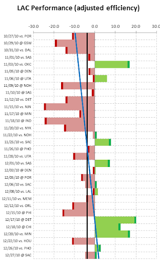
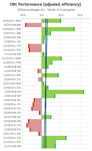
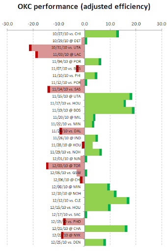
This is a pretty basic concept, but I thought I'd see what everyone thought.
These charts are a sort of low-level infographic of the games each team has played, their performance, and whether they won or not.
What is unusual is that the performance level listed here is the team's efficiency differential, ADJUSTED for location, rest-day situation, and opponent. So one can see when a team had a bad day but lucked out based on a weak opponent and/or rest and location advantage.
OKC today:
Dallas today:
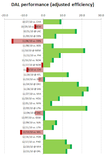
Note both teams are rather lucky; OKC in particular.
I seriously need to learn how to use some better visualization software. Are there any particularly good "infographic" packages that I could learn without a ton of time spent?
_________________
GodismyJudgeOK.com/DStats
Twitter.com/DSMok1 |
|
| Back to top |
|
 |
Ryan J. Parker
Joined: 23 Mar 2007
Posts: 711
Location: Raleigh, NC
|
| Posted: Mon Dec 27, 2010 5:40 pm Post subject: |
|
|
If you learn R you can build whatever visualization you might be able to imagine (but don't expect an easy button)!
_________________
I am a basketball geek. |
|
| Back to top |
|
|
MattB
Joined: 22 Jun 2006
Posts: 38
Location: Lowell
|
| Posted: Mon Dec 27, 2010 6:37 pm Post subject: |
|
|
There are pretty cool.
Easy way to quickly get a lot of information. The Dallas one is pretty amazing. Do you have/plan to do all teams, I would imagine that seeing them together would be even more interesting. |
|
| Back to top |
|
|
bbstats
Joined: 25 Apr 2010
Posts: 46
|
| Posted: Mon Dec 27, 2010 8:47 pm Post subject: |
|
|
Wouldn't it make the most sense to just give each game a value of
=Actual minus Expected efficiency margin ?
Unless that's what you did -- although Dallas is so green-heavy it doesn't appear that way.
EDIT: I suppose in theory what you're doing is roughly Actual - Expected + Average, which makes a bit more sense for comparing between teams - i think I thought you were just trying to compare games within teams.
_________________
http://thebasketballdistribution.blogspot.com
http://twitter.com/bbstats |
|
| Back to top |
|
|
DSMok1
Joined: 05 Aug 2009
Posts: 611
Location: Where the wind comes sweeping down the plains
|
| Posted: Mon Dec 27, 2010 10:05 pm Post subject: |
|
|
| bbstats wrote: | Wouldn't it make the most sense to just give each game a value of
=Actual minus Expected efficiency margin ?
Unless that's what you did -- although Dallas is so green-heavy it doesn't appear that way.
EDIT: I suppose in theory what you're doing is roughly Actual - Expected + Average, which makes a bit more sense for comparing between teams - i think I thought you were just trying to compare games within teams. |
I did: actual game margin - rest day expected - home/away - opponent eff margin = adjusted efficiency (which is what is graphed)
So the team's adjusted efficiency differential for the year would actually be the average of these bars.
_________________
GodismyJudgeOK.com/DStats
Twitter.com/DSMok1 |
|
| Back to top |
|
|
Serhat Ugur (hoopseng)
Joined: 13 Oct 2006
Posts: 209
Location: Basketball Research
|
| Posted: Tue Dec 28, 2010 2:55 am Post subject: Re: Team Performance Charts |
|
|
| DSMok1 wrote: |
I seriously need to learn how to use some better visualization software. Are there any particularly good "infographic" packages that I could learn without a ton of time spent? |
Try Google Charts. Once you learn the logic, it's very easy to implement.
http://code.google.com/apis/chart/docs/gallery/bar_charts.html
_________________
http://www.nbastuffer.com |
|
| Back to top |
|
|
Mike G
Joined: 14 Jan 2005
Posts: 3604
Location: Hendersonville, NC
|
| Posted: Tue Dec 28, 2010 8:36 am Post subject: |
|
|
I think these are quite great. We see that Dallas underperformed vs Det and Sac, yet still won. This makes me want to see the Knicks and their winning run vs a bunch of below-average comp.
If road/home were more visibly incorporated, that might be good. A road swing or a home stand has its characteristic 'feel' to it, and the little @ symbol doesn't tie things together visually.
What we don't see at all is margin of victory (or loss). For example, one of the Mavs' best games (longest green) is vs SAS on 11-26 -- some 23 points above avg differential. This was a 9 point victory, on the road. Perhaps a black line crossing the green stripe, 9 points from the median?
Too much information becomes clutter. It's very close to just-right, as is, IMO.
A side-by-side of 2 teams about to meet, especially in playoffs, would be sweet.
_________________
`
36% of all statistics are wrong |
|
| Back to top |
|
|
DSMok1
Joined: 05 Aug 2009
Posts: 611
Location: Where the wind comes sweeping down the plains
|
| Posted: Tue Dec 28, 2010 9:16 am Post subject: Re: Team Performance Charts |
|
|
It's not exceptionally powerful, unfortunately.
http://chart.apis.google.com/chart?chxr=0,-25,25&chxt=x&chbh=a,1&chs=400x567&cht=bhs&chco=8BD383,008000&chds=-25,25,-25,25&chd=t:12.4,-1.2,-20.6,-18.1,5.5,-2.3,4,-1.7,-13.4,17.5,15.2,18.4,3.3,2.9,-8.7,4.2,3.3,5.7,-1.6,-13.9,-3.1,-0.8,8.9,11.4,16.5,9.2,0,-7.4,15.7,-8.2,7.3|1,1,-1,-1,1,-1,1,1,-1,1,1,1,1,1,-1,1,-1,1,1,-1,1,-1,1,1,1,1,1,-1,1,-1,1&chdlp=t&chtt=OKC+Team+Efficiency+(through+11%2F26%2F10)
I wish I had more control over colors, and could add lines on the bar chart at, say, the actual margin or the required margin to win.
EDIT: that url doesn't work in the url tags.
Has anyone worked with Tableau public?
_________________
GodismyJudgeOK.com/DStats
Twitter.com/DSMok1 |
|
| Back to top |
|
|
Serhat Ugur (hoopseng)
Joined: 13 Oct 2006
Posts: 209
Location: Basketball Research
|
| Posted: Tue Dec 28, 2010 9:28 am Post subject: Re: Team Performance Charts |
|
|
| DSMok1 wrote: |
It's not exceptionally powerful, unfortunately.
http://chart.apis.google.com/chart?chxr=0,-25,25&chxt=x&chbh=a,1&chs=400x567&cht=bhs&chco=8BD383,008000&chds=-25,25,-25,25&chd=t:12.4,-1.2,-20.6,-18.1,5.5,-2.3,4,-1.7,-13.4,17.5,15.2,18.4,3.3,2.9,-8.7,4.2,3.3,5.7,-1.6,-13.9,-3.1,-0.8,8.9,11.4,16.5,9.2,0,-7.4,15.7,-8.2,7.3|1,1,-1,-1,1,-1,1,1,-1,1,1,1,1,1,-1,1,-1,1,1,-1,1,-1,1,1,1,1,1,-1,1,-1,1&chdlp=t&chtt=OKC+Team+Efficiency+(through+11%2F26%2F10)
I wish I had more control over colors, and could add lines on the bar chart at, say, the actual margin or the required margin to win.
EDIT: that url doesn't work in the url tags.
Has anyone worked with Tableau public? |
Nice work, though. Best part of google charts is that you can save the chart as a png image file.
This looks like more professional in case you have an database and have the abililty to create xml files in order to feed the charts. http://amcharts.com/
_________________
http://www.nbastuffer.com |
|
| Back to top |
|
|
DSMok1
Joined: 05 Aug 2009
Posts: 611
Location: Where the wind comes sweeping down the plains
|
|
| Back to top |
|
|
DSMok1
Joined: 05 Aug 2009
Posts: 611
Location: Where the wind comes sweeping down the plains
|
|
| Back to top |
|
|
|
|
You cannot post new topics in this forum
You cannot reply to topics in this forum
You cannot edit your posts in this forum
You cannot delete your posts in this forum
You cannot vote in polls in this forum
|
Powered by phpBB © 2001, 2005 phpBB Group
|