|
APBRmetrics
The statistical revolution will not be televised.
|
| View previous topic :: View next topic |
| Author |
Message |
Ed Küpfer
Joined: 30 Dec 2004
Posts: 787
Location: Toronto
|
 Posted: Fri Jun 09, 2006 4:59 pm Post subject: More Aging Stuff Posted: Fri Jun 09, 2006 4:59 pm Post subject: More Aging Stuff |
 |
|
Analysis of aging is difficult becase of the noise. In the graphs below, I've taken steps to remove as much noise as possible by regressing player stats to the mean, and also accounting for differences in year-to-year variations, position-by-position variations, and player ability. Here are the stats I looked at:
| Code: | Player Descriptions:
Ht - Height in inches
Wt - Weight in pounds
AGE - Player age as of July 1
POS - Player position. Restricted to the 5 position spetrum of PG-SG-SF-PF-C. Players retain their positional designations throughout thier careers. |
| Code: | Player Performance:
MPG - Minutes per game.
P2 - 2-pt percentage.
P3 - 3-pt percentage.
FL - Fouled %, estimate of Times Fouled (0.44*FTA)/Possession.
OR - Offensive Rebounding Percentage.
DR - Defensive Rebounding Percentage.
TO - Turnover Percentage, TO/Poss
ST - Steals Percentage: (STL/MIN)/(OppPOSS/OppMIN)
BL - Block percentage: (BLK/MIN)/(OppFGA/OppMIN)
AS - Assist Percentage: (AST/MIN)/((TeamFGM-FGM)/TeamMIN)
QA - Own-Asisted Percentage. See Basketball On Paper for formula.
|
That gives us ten binomials stats to regress, plus MPG, which I won't regress. I like binomials: regression for these are much simpler than for multinomials like EFG% or TS%.
What I want to do, ultimately, is trace the career trajectories of the stats above for the players in my sample. To get a meaningful result, I need to transform the stats so that each player is comparable. Things I need to account for:
* League enviroment. Some seasons, it seems, it's easier to shoot the 3, or to grab the offensive rebound. The league-wide average needs to be accounted for.
* Player ability. It would be pointless to compare the career trajectory of Shaq's 2pt% with Mike Gminski's, since Shaq's worst season is better than Gminski's best.
* Positional ability. A PG who converts 10% of his offensive rebounding opportunities is much more exceptional than a center who does the same.
* True player ability. Actual player performances are noisy. We can estimate true ability by regressing the actual performance to the mean.
Here's the procedure I used to transform an aribtrary Player Stat into a Centered Regressed League-Adjusted Player Stat.
| Code: | Player Stat
-> regress (Player Stat) to (Year Position Avg)
= Regressed Player Stat
-> subtract (Year League Avg) from (Regressed Player Stat)
= League-Adjusted Regressed Player Stat
-> substract CareerAvg(Lg-AdjRegrPlyStat) from (League-Adjusted Regressed Player Stat)
= Centered Regressed League-Adjusted Player Stat
= PlyStat |
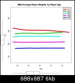
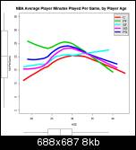
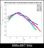
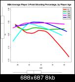
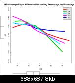
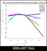
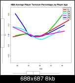
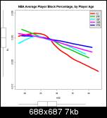
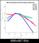
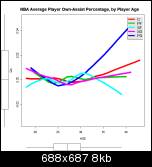
Once I've done all that, I can plot each of those stats against the player's age, which I've done on the charts below.
A word on the charts. They show one line for each position. This line is a lowess smoothed representation of the central tendency for each position. This is really the only way to show multiple groups on a single graph, since the thousands of points would mask the underlying career trajectory. I hope everyone can read the graphs easily. The weirdest one is the three-point shooting line for centers. I am at an utter loss to explain it.
Height
Weight
MPG - Minutes per game.
P2 - 2-pt percentage.
P3 - 3-pt percentage.
FL - Fouled %
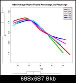
OR - Offensive Rebounding Percentage.
DR - Defensive Rebounding Percentage.
TO - Turnover Percentage
ST - Steals Percentage
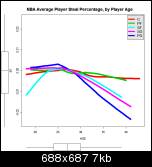
BL - Block percentage
AS - Assist Percentage
QA - Own-Asisted Percentage.
_________________
ed
Last edited by Ed Küpfer on Fri Jun 09, 2006 6:00 pm; edited 1 time in total |
|
| Back to top |
|
 |
Mark
Joined: 20 Aug 2005
Posts: 807
|
| Posted: Fri Jun 09, 2006 5:53 pm Post subject: |
|
|
Impressive work as usual and rich with information.
Viewing Ed’s graphs, these are my first impressions:
Height. For centers being over 7 foot can aid longevity a little. Not really a surprise. For young shooting guards, outstanding height seems correlated with coming thru or getting you thru the door but by 23-24 yrs many of the tall SGs who don’t have a mix of enough of the necessary skills to compete are perhaps weeded out and average height settles down.
Weight. Heavy centers see a lot of weeding out too by 25 and lighter seems more common among the long serving. I guess the failure rate is higher among the huge guys than the less imposing, who must impress the scouts more with their skill level?
Minutes. For small forwards, perhaps the long careers at big minutes of the Reggie Millers, Scottie Pippens and others give the minute chart more of a tail than for other positions. And maybe it also says something about the relative low quality of young SFs, the difficulty of them to break thru and get on the court over the vets, and /or the multiplicity of young categorized as SFs carried on a roster, hurting their minutes played averages?
Rebounding. You probably don’t want to hold a contract on a rebounder past 31 unless they are quite strong and considered above averge in likelihood of enduring at an acceptable rate?
Turnovers. Seniors improve in taking care of the ball.
In general from the whole collection. Holding players past 33 needs very careful consideration of a player’s unique career curve to date and projected. Age shows many signs of catching up with players, or at least most players. Seems generally in line with past research on age, career curves. Any nuance that breaks from the conventional wisdom?
Last edited by Mark on Sat Jun 10, 2006 12:00 pm; edited 5 times in total |
|
| Back to top |
|
|
Ed Küpfer
Joined: 30 Dec 2004
Posts: 787
Location: Toronto
|
| Posted: Fri Jun 09, 2006 7:55 pm Post subject: |
|
|
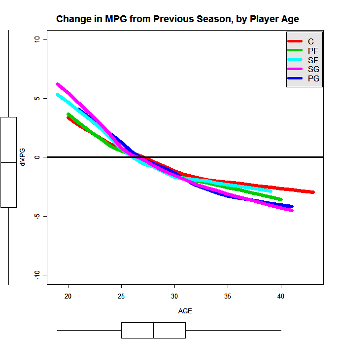
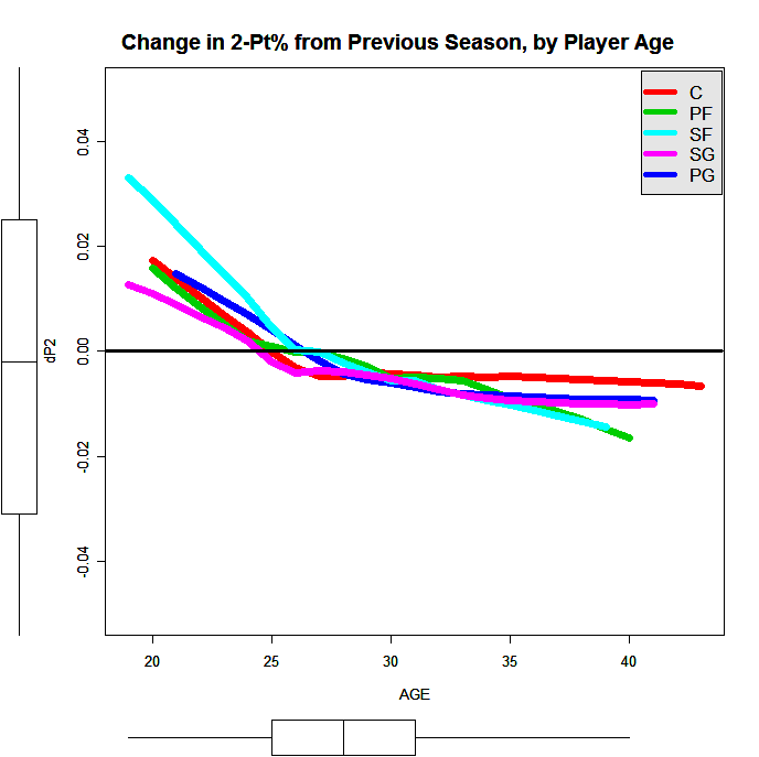
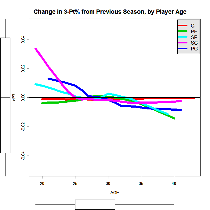
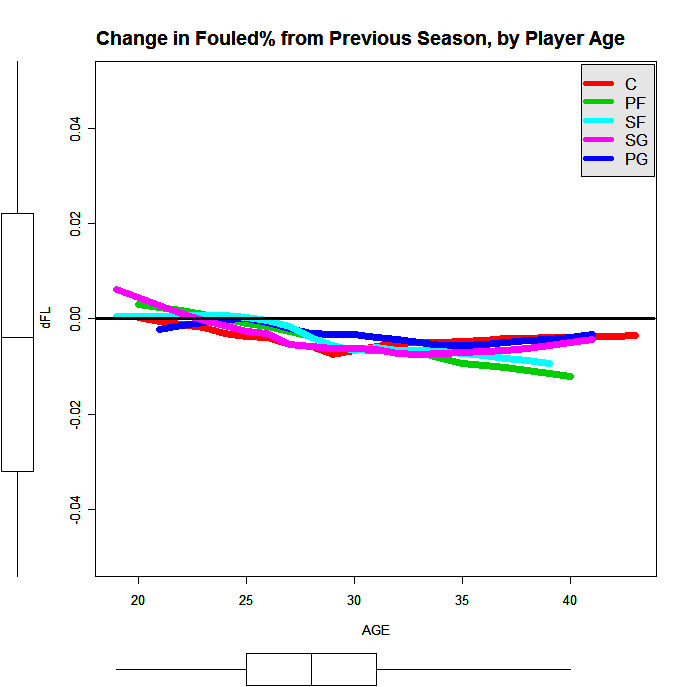
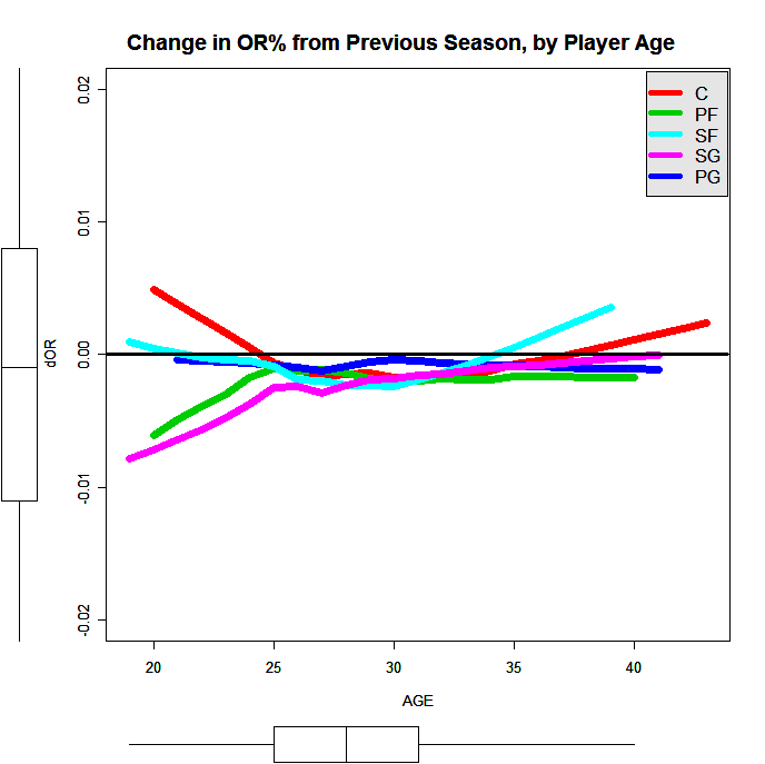
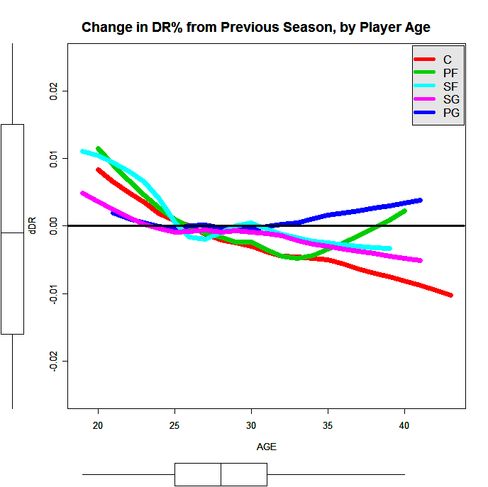
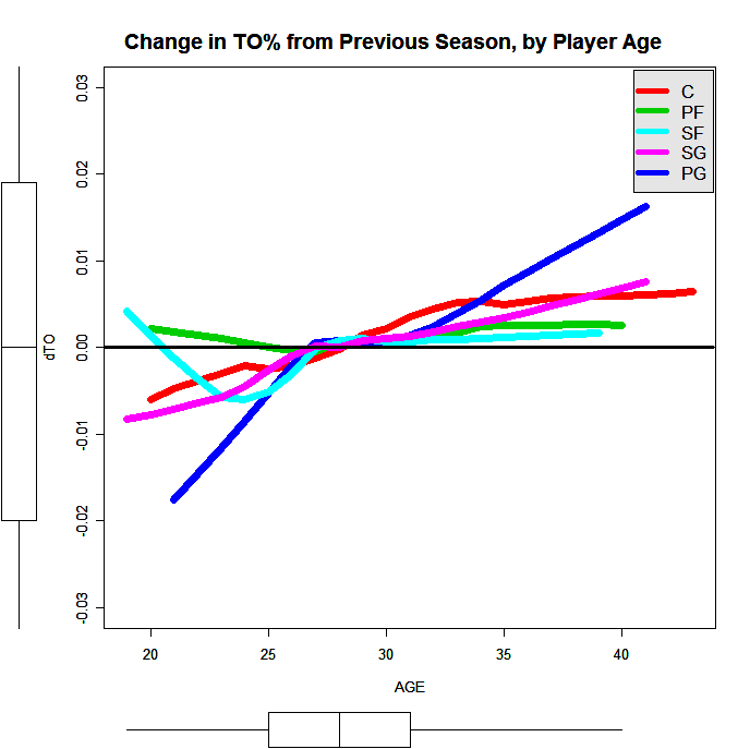
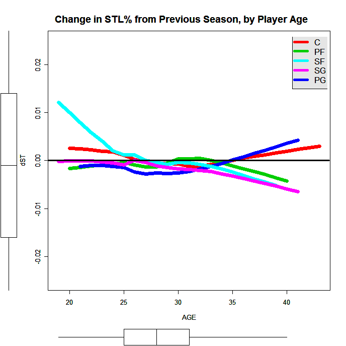
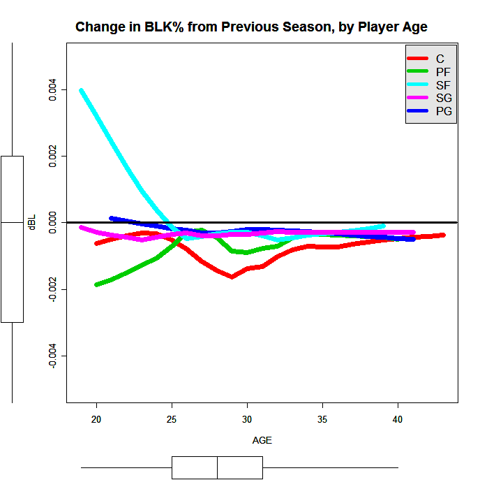
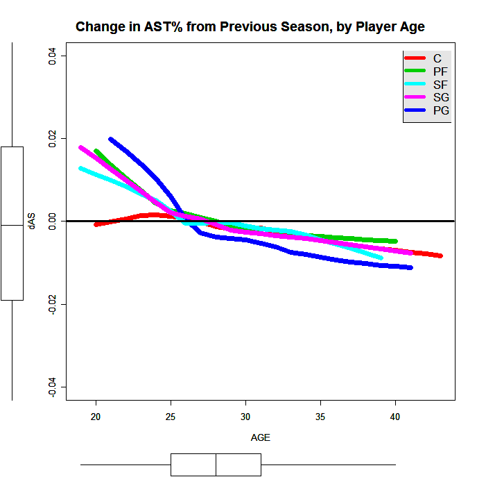
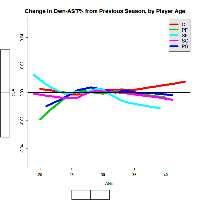
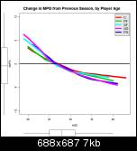
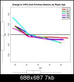
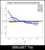
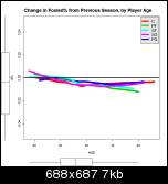
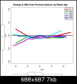
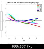
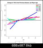
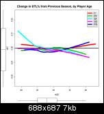
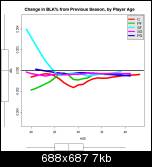
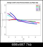
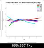
Mark, I think the following graphs will be easier to read. They show the same data as above, but as the amount of change from the previous season. The black horizontal line at zero represents no change in the player's stats from the season before. If you can picture a player's career as following an inverted-U shaped arc, that path will be displayed on these graphs as a more-or-less straight line from the top left to the bottom right.
Minutes per game
2-pt percentage.
3-pt percentage
Fouled %
Offensive Rebounding Percentage
Defensive Rebounding Percentage
Turnover Percentage
Steals Percentage
Block percentage
Assist Percentage
Own-Asisted Percentage
_________________
ed |
|
| Back to top |
|
|
Mark
Joined: 20 Aug 2005
Posts: 807
|
| Posted: Fri Jun 09, 2006 8:23 pm Post subject: |
|
|
I understand your explanation of how these new charts are expressed. The first defensive rebounding chart looks like fairly dramatic decline for PF/C but very gradual in second set because the rate of change is relatively constant, not accelerating. Function curve and derivative of that function curve.
And in general the climb to the peak performance level on these stats is quicker in pace and shorter in time than the decline. Before 24 and after 35 seems to show more movement and positonal variation, perhaps affected by smaller groups.
2 and 3 point shooting percentages see moderate dropoff rate between 27 and 30 then the dropoff continues but at a noticeably slower rate.
(I assume each set only looks at those player that persist in the league, letting players drop out without effect on averages rather than assigning zero production stats and keeping them in the dataset). |
|
| Back to top |
|
|
Ed Küpfer
Joined: 30 Dec 2004
Posts: 787
Location: Toronto
|
| Posted: Sat Jun 10, 2006 12:35 pm Post subject: |
|
|
| Mark wrote: | | I understand your explanation of how these new charts are expressed. The first defensive rebounding chart looks like fairly dramatic decline for PF/C but very gradual in second set because the rate of change is relatively constant, not accelerating. Function curve and derivative of that function curve. |
You got it. Rates of change are really hard to me to grok. Charts like these help me understand by presenting the data in a more linear way. There may be an additional factor WRT DR%, since the two sets of charts used two different datasets: the first set used all the data in my sample, the second used only player-seasons in which the player had played the previous season. Obviously this rules out rookie seasons, and also seasons-missed. I think the second dataset was 20% smaller than the first.
| Quote: | | And in general the climb to the peak performance level on these stats is quicker in pace and shorter in time than the decline. The position lines show a fair amount of variation on amount of ascent in set one and in slope for rate of change in the second set. |
Keep in mind the absence of the rookie data mentioned above. I may try this excercise again, using years played instead of age.
| Quote: | And it appears, from the relative smoothness of the curves to my eye,
|
Careful here. The charts present a lowess smoothed regression line, not the actual regression line -- much less the actual data. In real life, the data is much messier. Here is the DR% data, not separated by positions:
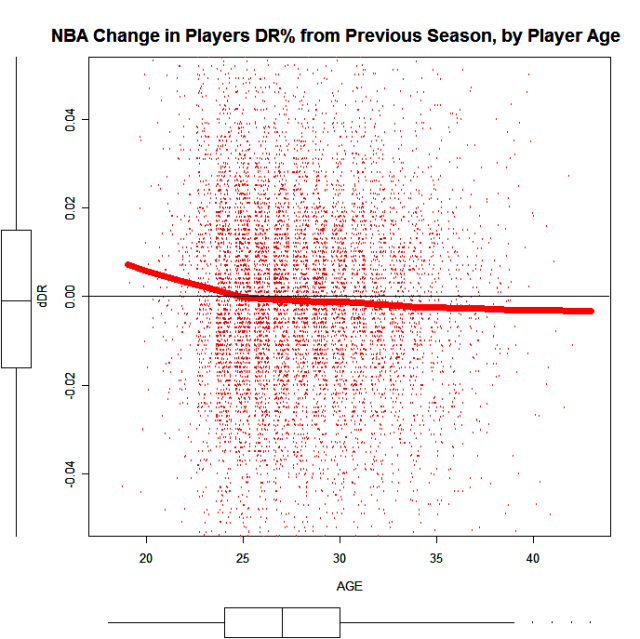
It's hard, really, to say anything definite about the patterns here, except in the overall sense. I'm trying to think of any other ways of presenting these data. I'm also trying to think of a way to model this so I can say something like, If player X's DR% decreased by 5% last season, what is the probability of an increase in the next season?
_________________
ed |
|
| Back to top |
|
|
Mark
Joined: 20 Aug 2005
Posts: 807
|
| Posted: Sat Jun 10, 2006 4:02 pm Post subject: |
|
|
Yes, I editted out the smoothness comment because I recognize that the smoothed lines can seduce to that "line" of thinking when the background data is as messy as you now show.
With your emphasis on the future and prediction, the effort you mention does
sound interesting and expected. League based answers for performance after unusual bounce years, or forecasts for continuing a longer term upward or downward trend would be quite interesting. As you might say, it could give a baseline to compare your player specific assessment against or it could be used as part of building that player specific assessment.
Dean and Dan probably could say some interesting things here about methods, and adjusting methods and experience with these methods if they felt they could without over-relevation. |
|
| Back to top |
|
|
Ed Küpfer
Joined: 30 Dec 2004
Posts: 787
Location: Toronto
|
| Posted: Thu Jun 15, 2006 4:59 pm Post subject: |
|
|
I'm not altogether satisfied with the stuff above. I was plotting changes from one season to the next in various players stats against the age in which these changes took place. The idea is fine, but it would have been more useful to use the number of NBA seasons played instead of player age. Also problematic is the lowess regression line I used to summarise the changes. Lowess smoothing always suggests to me a discriptive approach rather than explanatory. To rectify those problems, I'll introduce a different approach below, quantile regression.
Oridnary least squares is pretty much the bread and butter regression approach. I won't bother explaining the method, but I want to say something about the results you end up with. When you use OLS to regress a response variable against a predictor variable, the results will look something like Respose' = Constant + Coefficient*Predictor. The Response' is the expected response given the predictor. This expected response maps closely to the average (mean). What that means is, given an arbitrary predictor P, the average reponse will be Response'.
Nothing objectionable there. But there's no reason to focus only on the mean response. In fact, if you have a skewed distribution, you may want instead to focus on the median response, which is less sensitive to outliers. If you do some median regression, you'll get a result that returns coefficients and a constant that optimises a median response, rather than a mean response. And now, if you're going to the trouble of regressing to the median, you can generalise that method to regress to any quantile -- regressing to the median (50th percentile) uses the same method as regressing to the 75th percentile, or the 95th, or… In my analysis, I'll use the 5th, 25th, 50th, 75th, and 95th percentiles. I'll use the R package 'quantreg' for the calcualtions. (OLS, as the name suggests, uses squared errors to optimise the reponse. Quantile regression uses absolute deviations.)
Right. Let's look back at minutes per game (if it's not obvious, I used YEAR and YEAR^2 to plot these):
MPG
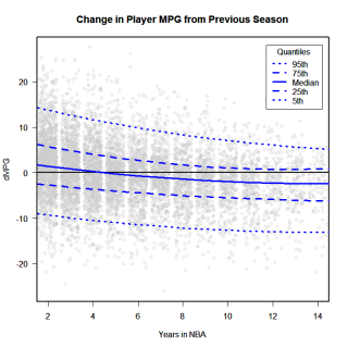
(Once again, clicking the images will take you to a larger sized image.)
The solid line is the median, and it looks a lot like the lowess line in the chart from a previous post. Where this is different is the pseudo-confidence intervals, the quantiles. Look at the column of points over the Year 2 marker. This shows how players' minutes per game played changed after their rookie seasons. The median line is above zero, which means that more than half of all year 2 players increased their MPG. Looking upwards, we see that 25% of all year 2 players (ie players at the 75th percentile) increased their MPG by about 5 or more minutes. Five percent of all players increase their MPG by 15 or more.
What's interesting to me is that while some stats show a clear aging pattern (ie increas -> peak -> decrease), other stats show a negligable or zero aging pattern. Block%, offensive rebounding%, defensive rebounding% in particular show about as much propensity to increase in any given season as to decrease. Even for MPG, which shows a clear aging pattern, there is still a 25% chance that any given player in any given season will see his minutes increase.
2-Pt%

3-pt%

Fouled%

Off Reb%

Def Reb%

Assist %

Own-Assist%

Steal%

Block%

Turnover%

_________________
ed |
|
| Back to top |
|
|
Mark
Joined: 20 Aug 2005
Posts: 807
|
| Posted: Thu Jun 15, 2006 5:34 pm Post subject: |
|
|
I like the additional detail provided by your regression choice and the graphs from it including the background dots. Conveys a strong sense of the diversity in contrast with the mean lines in the earlier sets.
"Even for MPG, which shows a clear aging pattern, there is still a 25% chance that any given player in any given season will see his minutes increase. "
In addition to pure talent evaluation which should increase and decrease minutes based on performance and fit it is probably also influenced by impacts from the salary cap, teams over the cap, budgets, free agent competition and shortfalls filling needs; players changing teams; wanting to get time for young players; injuries/opportunities for others/returns,etc. |
|
| Back to top |
|
|
Ed Küpfer
Joined: 30 Dec 2004
Posts: 787
Location: Toronto
|
| Posted: Thu Jun 15, 2006 6:34 pm Post subject: |
|
|
| Mark wrote: | | I like the additional detail provided by your regression choice and the graphs from it including the background dots. Conveys a strong sense of the diversity in contrast with the mean lines in the earlier sets. |
That's a good point, one that I often overlook. The nature of variation is not intuitive -- we tend to focus on abstract representations like averages or extremes. But the acual data are so diverse, that any single respresentation will not capture much of it.
Even moreso with the data presented above. Those dots are all regressed, centered, and adjusted -- tranformations that reduce the amount of variation. But even still, the variation in the data overwhelm the general trends. There's an important lesson here, somewhere.
_________________
ed |
|
| Back to top |
|
|
|
|
You cannot post new topics in this forum
You cannot reply to topics in this forum
You cannot edit your posts in this forum
You cannot delete your posts in this forum
You cannot vote in polls in this forum
|
Powered by phpBB © 2001, 2005 phpBB Group
|